 studiomorefolio
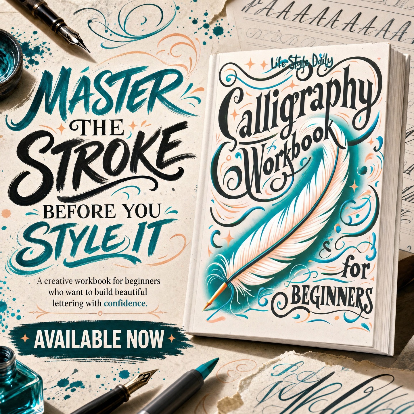
studiomorefolio Facebook ad: “Your lettering does not look bad because you…”
Ran for 40 days, from May 4 to June 13, 2026, the last day Crush saw it.
Run by studiomorefolio on Instagram. Crush is not the advertiser and does not verify its claims. See this ad in Meta's Ad Library(opens in a new tab)
Want an ad like this for your product?
Crush makes new ad images for your product from this ad: your logo, your product photo, your offer.
Trials from $19.95 USD, then $79.95 USD a month. Cancel anytime.
About this ad
- Meta Ad Library ID
- 2156626278468864
- Platforms
- Relaunches
- 0
Ad text
Your lettering does not look bad because you lack talent. It looks uneven because your hand has not learned the basic strokes yet. This Calligraphy Workbook for Beginners helps you slow down, follow the shapes, and build real control step by step. Inside, you can practice letterforms, curves, swashes, spacing, and smooth movement until your hand starts to understand the rhythm behind beautiful calligraphy. No pressure. No confusing theory. Just guided practice that helps your lettering finally feel more natural. Start with the stroke. Build the style. Available now.