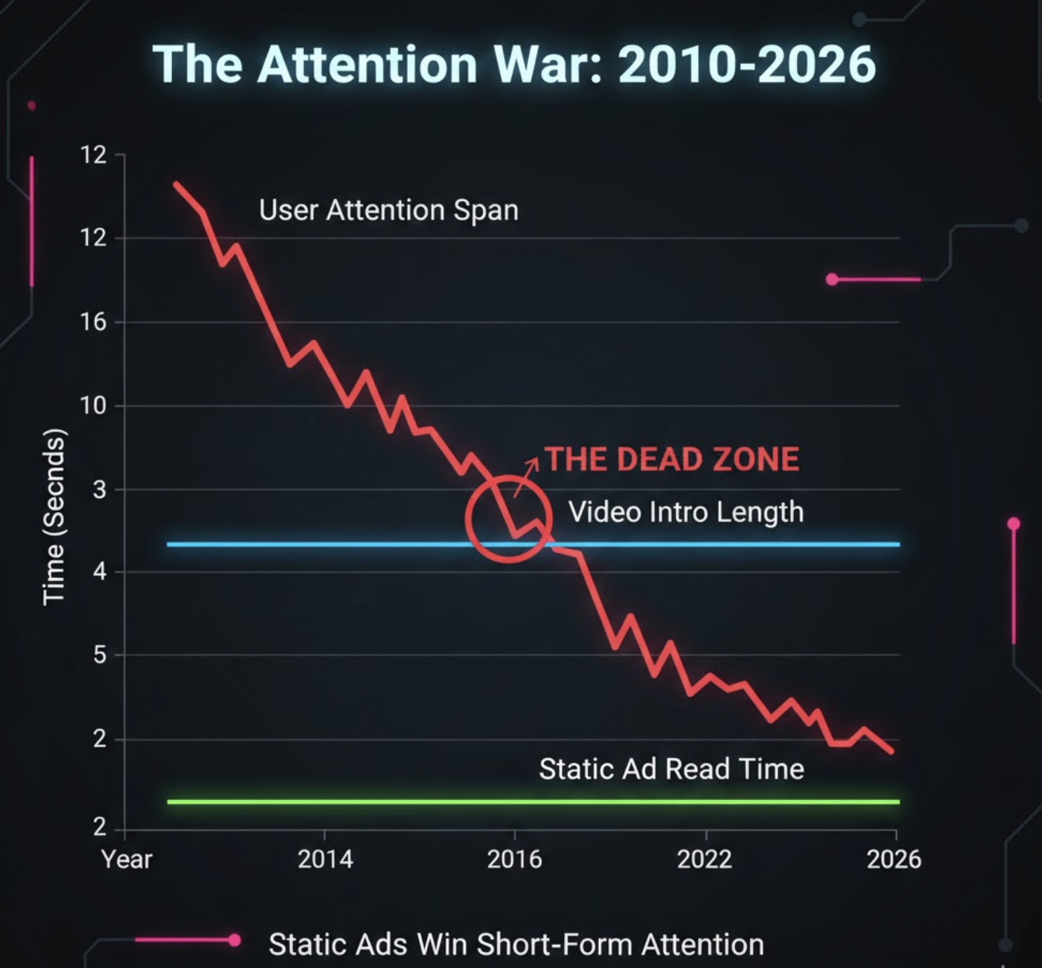
For the last five years, every "guru" has shouted the same advice: "Video is King! Pivot to Video! Reels! TikTok!"
And for a while, they were right. But in 2026, the pendulum has swung back.
We are seeing a massive resurgence in the performance of Static Ads. On many accounts, simple images are outperforming high-production videos by 30-50%.
Why is this happening?
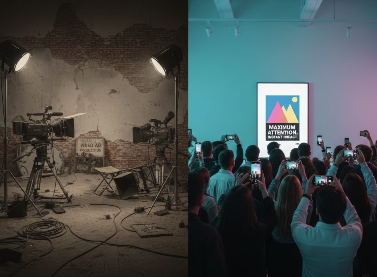
The Fatigue Factor: Why Static Ads Win the Attention Economy
Users are tired. Their brains are fried.
They are scrolling through a feed that is screaming at them. Fast cuts. Loud music. Dancing teenagers.
A static image offers a moment of calm. It provides instant comprehension. The user doesn't have to wait 3 seconds for the "hook." They see the offer, they understand the value, and they click.
In an attention economy where you have 0.5 seconds to make an impression, Static Ads are the fastest way to communicate your core message.
The Economics of Production: Scaling Static Assets
Video is expensive. It requires scripts, actors, editors, and significant time investment.
Static images are cheap. And when you combine them with AI, they are essentially free.
This matters because ad algorithms reward volume. If you want to avoid burning your budget during creative testing, static images give you a distinct edge. If you can test 100 static variations for the price of 1 video, you have 100x more chances to find a winner.
The math simply favors the static ad approach.
The Psychology of Static Creatives
Static ads work because they respect the user's intelligence. They don't force-feed a narrative. They present information logically and let the user decide.
They also feel more like native "content" than disruptive ads. A simple photo of a product on a kitchen counter looks like an authentic post from a friend, whereas a highly produced video immediately looks like a commercial.
The 3 Static Ad Frameworks Crushing It in 2026
Not all static ads are created equal. Here are the three visual frameworks that are currently driving the highest conversions:
1. The "Us vs. Them" Chart
A simple comparison table. Your product vs. the competitor. Checkmarks vs. X's. It's the oldest trick in the book because it works effortlessly to instantly establish value and superiority.
2. The "Notes App" Screenshot
A screenshot of the iPhone Notes app with a list of benefits or a genuine testimonial. It feels raw, authentic, and personal. It stops the scroll because people are naturally curious and nosey.
3. The "Press Release"
An image that mimics a news article headline (e.g., "Why Everyone in [City] is Buying This Pillow"). This framework successfully borrows authority and credibility from the traditional news format.
How to Design Static Ads for Feed vs. Story Placements
Feed (1:1 or 4:5 Ratios): Focus heavily on the visual. The text is secondary. The image must stand alone and tell the whole story.
Story (9:16 Ratio): Maximize the vertical space. Put the hook at the top (eye level) and the Call-to-Action (CTA) at the bottom (thumb level). Use interactive elements like polls to increase user engagement.
Testing Static vs. Video: A Proven Protocol
Don't rely on gut feelings. Test using a data-driven framework for validating ad creatives.
Launch a "Creative Sandbox" campaign (CBO strategy is recommended).
Create one ad set exclusively for Video and one ad set for Static images.
Put your best 3 videos in one and your best 3 images in the other.
Let them fight for conversions.
In 80% of the tests we run, the Static ad set ultimately secures a lower CPA. Why? Because the Cost Per Mille (CPM) is usually much cheaper on static inventory.
The "Hybrid" Creative Strategy
We aren't saying you should delete your TikTok account or abandon video entirely.
However, you should rebalance your creative portfolio. Your ad strategy should ideally be 80% static testing and 20% video scaling.
Use static ads to efficiently find the winning hooks. Once you know that "Angle A" works, then invest the capital to turn "Angle A" into a high-quality video. This is the most efficient way to spend your budget when scaling e-commerce ads.
The Ultimate Static Ad Design Template
Use this QA checklist for every static ad you create before launching:
The 3-Second Rule: Can a user completely understand the ad's core offer in under 3 seconds?
The Contrast Test: Does the text pop against the background? (Use free tools like Coolors.co to check color contrast).
The "Squint Test": If you squint your eyes, can you still clearly identify the product?
The CTA Button: Is there a visible button? Even though the entire image is clickable, adding a visual button increases Click-Through Rates (CTR) by up to 15%.
Tailoring Static Ads for B2B vs. B2C Audiences
The design rules completely change depending on your target demographic.
B2C (Business to Consumer): Use raw emotion. Leverage bold colors. Show the product in actual use. The primary goal is triggering impulse purchases.
B2B (Business to Business): Use rational logic. Showcase data charts. Use text-heavy images (similar to LinkedIn Carousels repurposed into ads). If your strategy is to target decision makers, the main goal is thorough education.
Advanced AI platforms like TryCrush.ai can automatically adapt your creative visual style based on whether you select "B2B" or "B2C" in the campaign settings.
Conclusion: Don't Overcomplicate Your Ad Creatives
Sometimes, a picture genuinely is worth a thousand words.
And in the 2026 media buying landscape, a simple picture is often worth a thousand dollars in scalable profit.
Don't let the persistent industry hype around short-form video blind you to the raw converting power of the simple static image.
Use automation tools like TryCrush.ai to effortlessly generate beautiful, high-converting static ads at scale. Give your audience exactly what they want: Absolute clarity.